Digital design is one of my favourite things.
I find drawing on Photoshop a lot more productive than drawing in a sketchbook.
I guess that is because I am a bit of a perfectionist – I can delete bit’s I do
not want and add in more layers in on Photoshop. I find that I use my
sketchbook as a starting point, as well as photography. I draw or capture
something that interests me, a view, a nice print, flowers, nature, landscapes etc.
I then always scan that in and use it as a starting point to create a design.
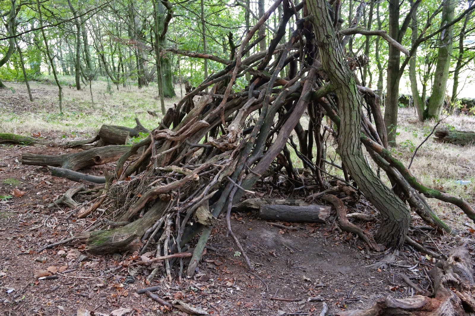 |
| Photo I took at YSP |
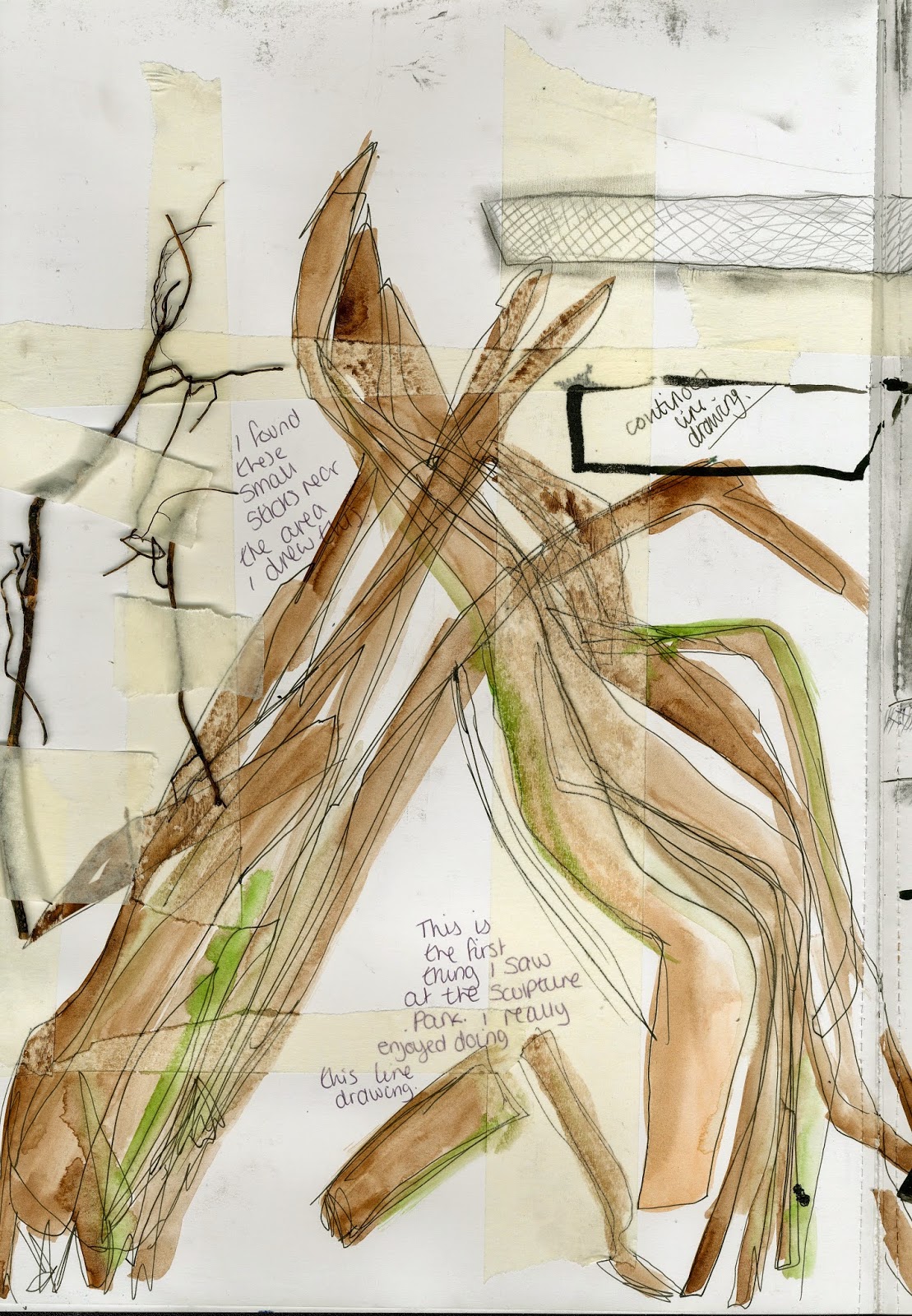 |
| Sketchbook drawing of picture above |
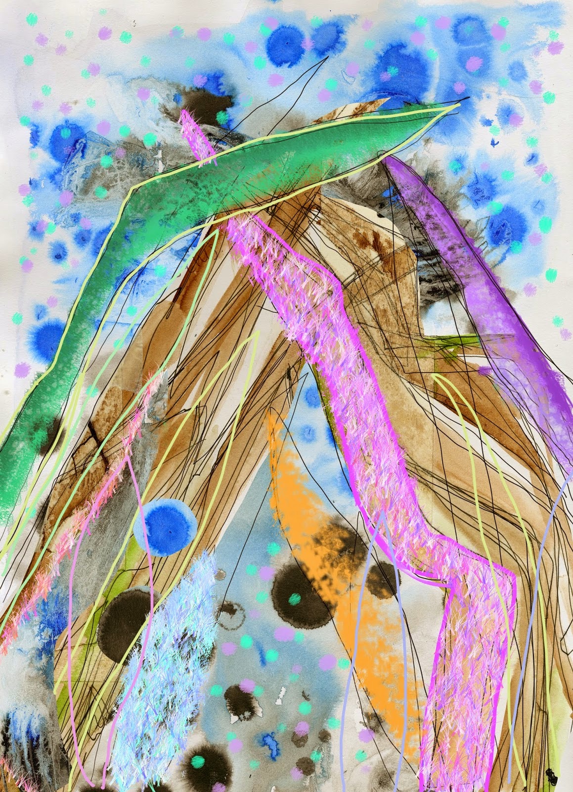 |
| design from picture and sketch above |
 |
| another design inspired by same picture and sketch |
First I took a photo, from the angle I
wanted to draw from. Then I sat and drew it, Quickly, Messy. I then scanned my
sketch in and worked on it in Photoshop. Using layers, different brushes,
filters and hue/saturation. From early
on in my art education I knew I loved working with colour’s. It makes every
design look better. I feel like if it was my work without the colour it simply
would not be my work at all. This design
was one of the first designs I created at university and did not include much
technical education at all. The second design I created inspired by the same
picture and sketch. I liked to rotate layers around to create a more repeatable
pattern rather than just a block type ‘picture/print.’
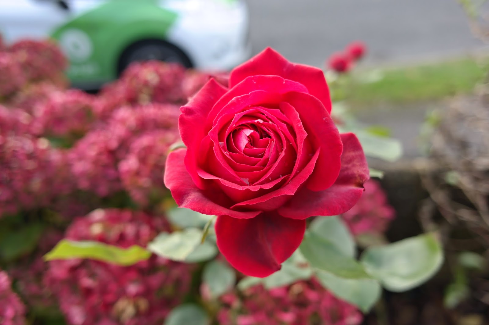 |
| photography from granddads garden |
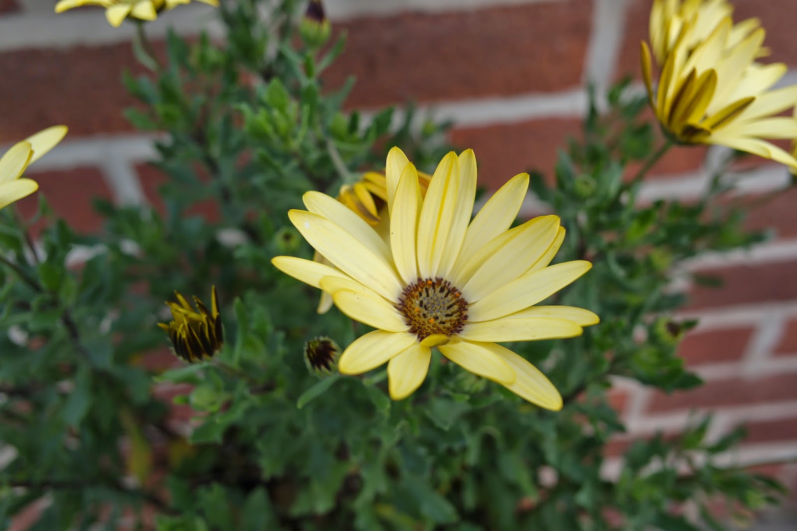 |
| photography from granddads garden |
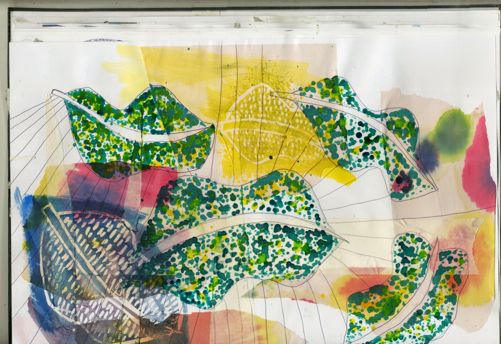 |
| sketchbook work inspired by the falling leaves at YSP |
When doing my commercial designer project I
wanted to create a print for fashion or interiors. I want all my work to have a
signature look therefore I kept it colourful! I took plenty of pictures of
flowers as my focus was on nature. I also kept in mind the leaf inspired
sketches I did in my sketchbook with inks and watercolours. Combining my
photography and sketching together I wanted to create a colourful layered up
design.
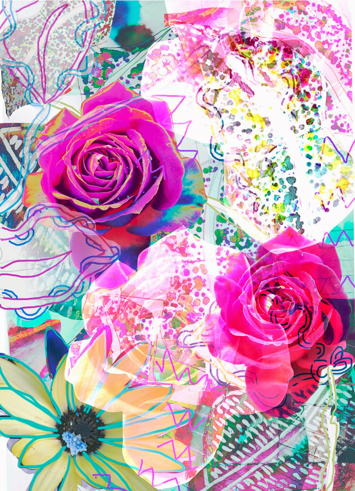 |
| Design inspired by photography and sketchbook work above |
Using layers, The lasso tool (to select and
copy area’s to new layers), Gradients, hue/saturation, filters, curves and many
more tool’s I create the design above. I was really happy with the outcome of
the design. I played around with layers and moving them around, This caused the
hue/saturation and curves to effect more or less area’s depending on where I
moved the layer’s. Being able to edit my work gives me a peace of mind as I
know I can edit it until I like the outcome. I can not do this just drawing in
a sketchbook and the worst feeling in the world is spending time on a drawing
and hating the outcome of it. I also love being brave with colour in my work
and digital design allows me to do that freely, I also like adding filters to
create texture in my work, This is not always easy when drawing by hand. I have
found a way of working where I can practice photography, drawing and my digital
design skills and I am really happy with this way of working. I will always
keep a sketchbook for my hand drawings as I can always use this as inspiration
or a starting point for many digital designs.


No comments
Post a Comment