Spring/Summer 16 mega trend Monumental is design driven, minimal and luxe and is aimed at 25-30+ year old's, It has a very modern, contemporary and minimal vibe about it yet still feels rural as the colours are black's, white, greys and earthy tones such as browns, oranges and gold's. This theme is also very dynamic and mysterious as one of it's key concepts is evolving technology, new super materials and new automotive ideas.

The technology concept for this trend is futuristic, innovative and dynamic. It's about thinking about side the box, or thinking their is no box at all. Creating new original idea's, materials and products. This concept could be inspired by films, Insurgent is a new film which has just premiered and soon to be released, The film trailer made me think a lot of this monumental mega trend as the film also incorporates technical products and idea's however also it features rural scenes.

Lifestyle and Design concepts include very minimal 'concrete zones' which feature geometric shapes, smooth textures and different scales. The spaces look cold and industrial. It pushes the limit of where you can use concrete and hard materials.

Architecture show's large scale strong, unique looking buildings that create a powerful impression.


Black and white's are really fun, They can create optical illusions and amazing eye warping structures.

Polygon fold inspired clothing have been popping up everywhere on the high street at the moment. Cape's are really on trend right now.

This concept is really interesting, Creating 3D parts on a garment by a certain knit or weave structure. It is very structural and tactile. It could be further developed by creating a full garment using a complex structure which allows you to create a full garment with 3D parts and also part's that go the opposite way, This idea could be generated to suit different body types by using different complex structures to make the garment.

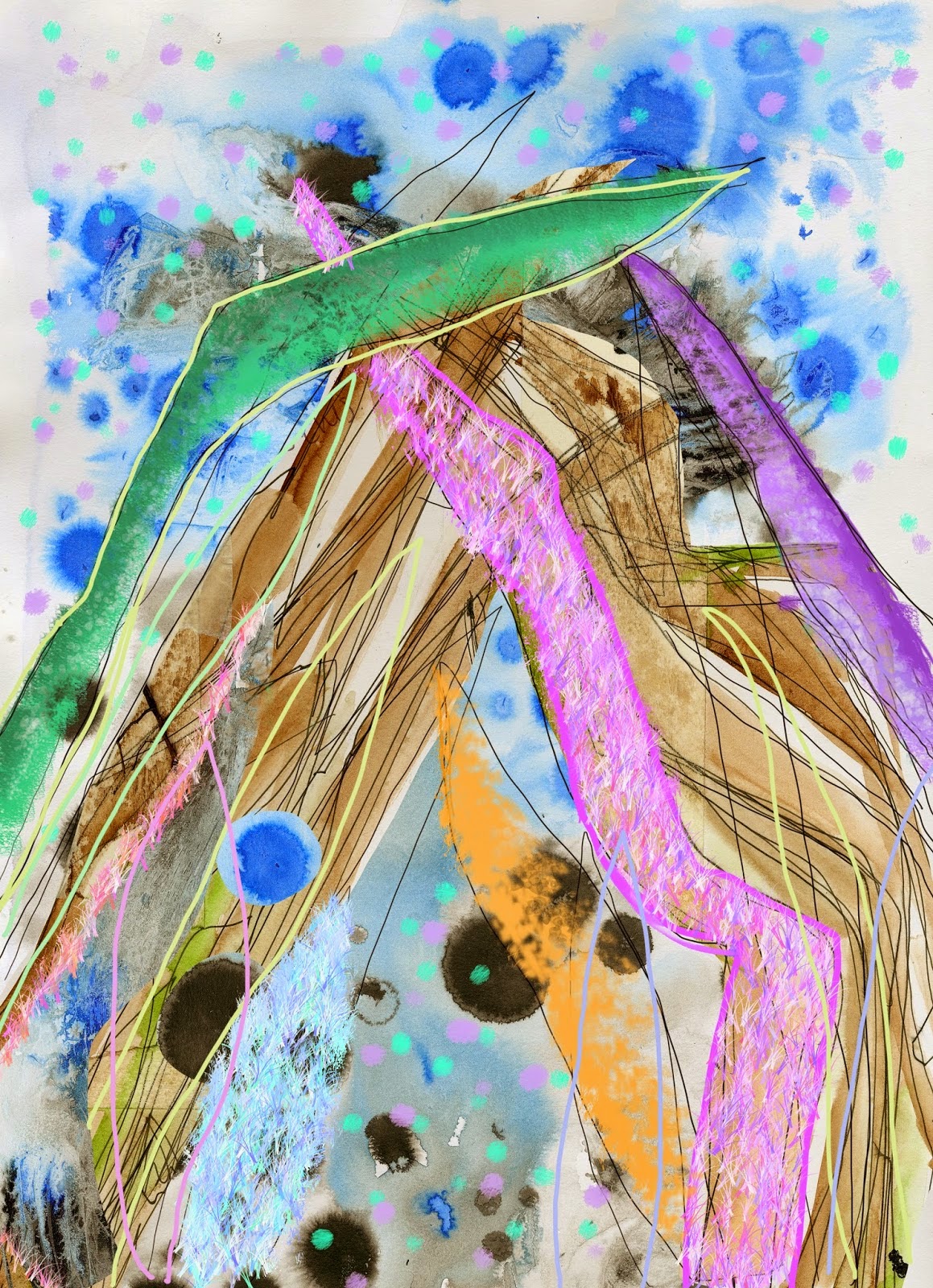
This key concept is all about volume, bulk and curves. This could be put into practice by knitting with un-conventional materials such as rubber to create large scale bulky knits.


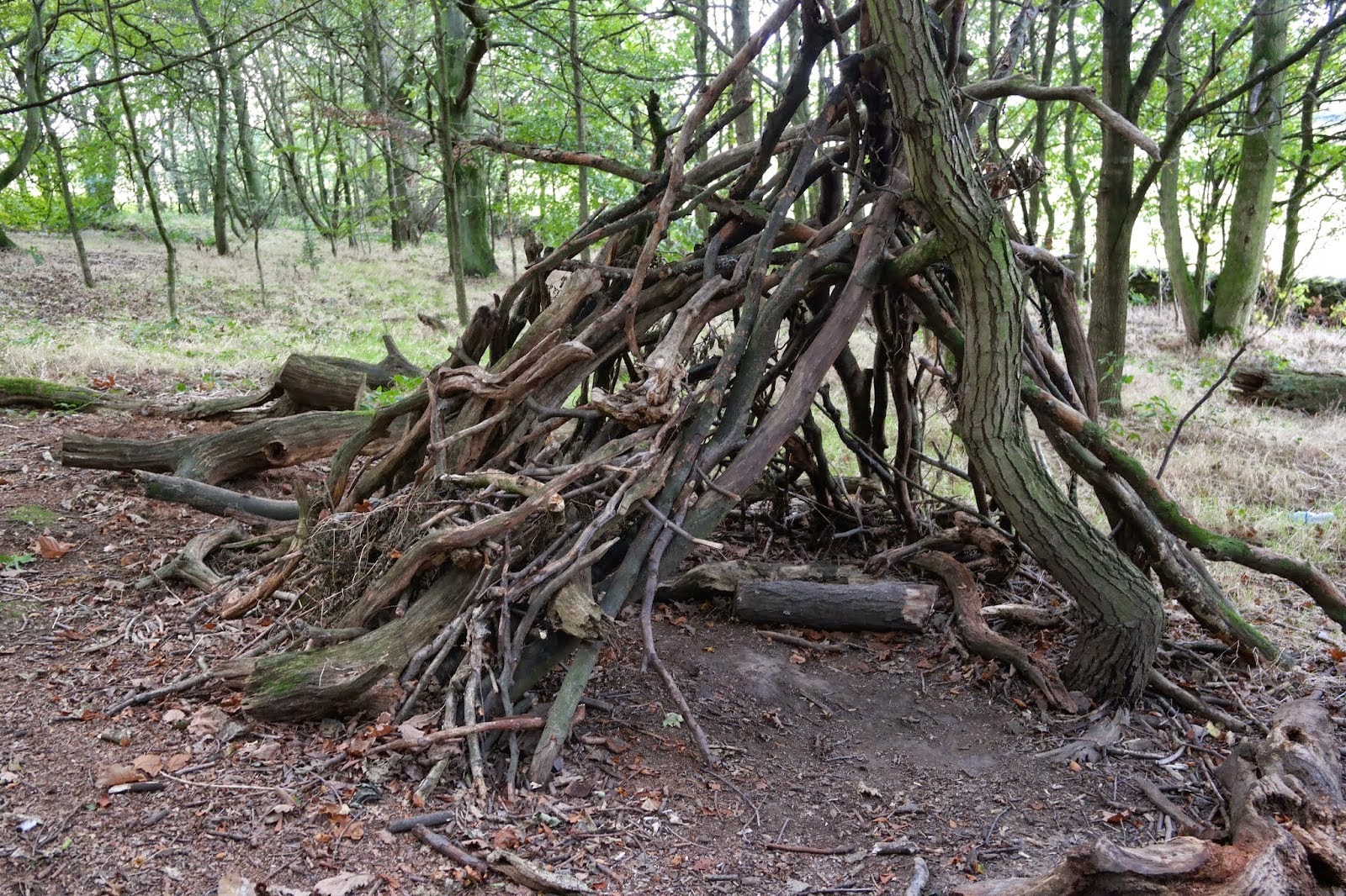
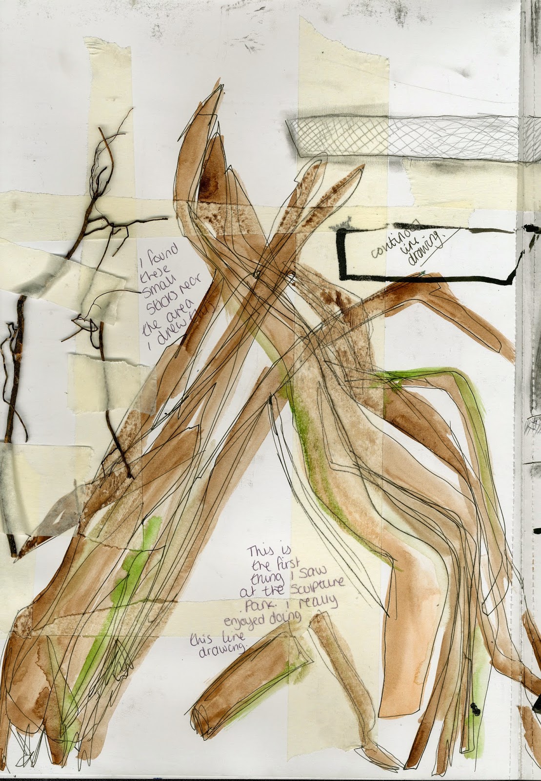
Stone Settlement is about mimicking the appearance off natural stone. The texture can be bold or subtle, You can put this effect into practice by using different medias such as charcoal, graphite, pencil etc to create texture rubbings from stones and stone walls.


Warrior Stance is a key concept for this monumental trend. It symbolises femininity, strength, independence and style. Performers and Artists such as Beyonce work this trend all the time.


Gold Geo Rush is all about geometric shapes and gold colour's. The pictures in this trend concept look a lot like honeycomb weave structure.


Retro Futurism and bronze age are my favourite concepts of this trend. The colours of gold,bronze,orange and black. "Retro futurism inspires a new age for eyewear' Bronze age "It creates a tarnished crust on the outer layer off dirty, dug up denim and coats footwear and interiors in a warm, rusty dusting of burnished bronze." I could put this into my own practice by using foiling.


Overall I think the key themes and concepts of this mega trend is structure, earthy colours, rural, natural forms inspired, futuristic and texture.
I think the key design features would be the colours which include black, white, grey, gold and bronze. I also think the geometric shapes, large scale, voluminous bulks,stone texture and smooth surfaces are the key design features.
Materials such as thick rubber to knit with, concrete to mould with and foil to print with could be a good starting point to create a product or garment inspired by this mega trend.