Featured Slider

Showing posts with label surface design. Show all posts

Summer Project | Textiles

During the summer I was asked to do a summer project, The brief I was given simply stated to 'Get an A1 piece of paper and do something with it'. It did not state if I could use other materials and did not say I could not cut up the paper. It did state to think outside the box or to communicate visually - So that's what I did
I decided to turn my A1 piece of paper into a visual journal. To communicate visually and show what thing's inspired me over the summer and to use different techniques to do so.

I cut up my A1 paper into A4 sized pieces and hole punched them all, I then got some string and tied them together to make a book. 

Thinking about things on my recent holiday to Lanzerote that inspired me, I decided to use different techniques such as line drawings, left hand drawings, watercolour, pastel, masking fluid... etc. I also used photo's from my holiday to show what inspired me.


As you can see I used lot's of different techniques to do this journal. I wanted to make it look as tactile as possible. I'm really happy with my summer project and it's got me in the right mind frame to start University and be creative. 

I hope you like my summer project. Leave me some feed back on how I could have improved or what you would do with an A1 piece of paper.

Thank you for reading!

Becca


A Day In The Life #5 - Printing Silk Scarfs

My plan for today was to go to college this morning to cut out my holographic heat transfer material for my big scarf as I need to do this first before I can start sewing on my needle felting's. When I got to college the print room was free and I was able to print which is a bonus as I want to get everything printed as soon as possible then I can concentrate on other things such as my needle feltings for my scarf and for in my petri dishes and also for my rings and earings which came today!! So excited about that!!

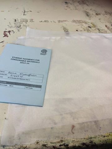
Today I printed two small scarf's, one silk and one muslin, using very different colour's. The first one was my silk scarf. I started off by masking taping the silk down to the print table which I had previously cleaned and dried. 


The first colour I printed was a turquoise and blue colour and after I printed it, it looked like this.


After I had printed blue I washed my screen and squeegee and put them to dry, I got out my second screen and put some clean gloves on and got printing, This time I printed a bright pink colour.


I really like how this one looked after the second screen but I was struggling to think of what colour to use on my final screen. I decided to use the silver pigment, Although I had not used this before or sampled it I thought it would look good so I went ahead and used it.


The end product looks really amazing the silver pigment gives such a good finished look and I am so glad I used it!! I washed my screen and squeegee and put them to dry and took the fabric I just printed into the classroom to dry, I then washed and dried the table.
The next scarf I printed was one I dyed, pressed and washed yesterday which is the orange and yellow muslin one aswell as an off cut from my big scarf which I had dyed a few days before. I started off by masking taping the fabric's to the table, I then got my colour's and first screen ready and started printing!! The first colour I used for these fabrics was a coral/orange pigment I mixed myself. 


Leaving my pigment to dry on the fabric I took my screen and squeegee in the wash room to clean and then placed my screen in the drying cupboard. When it was time to do the next screen I went for a bright pink and hoped it would look alright.


You can not really tell on the picture above but the out come of the second screen looked really good and bright. The pink and orange really complimented each other on the background colour of my fabric. I next printed a purple pigment after I had washed and put my screen to dry and got my last screen out. 


I really liked the outcome of this scarf, perfect for summer! When I took it off the table and into the class room to dry, The colours look really beautiful when the fabric floats! I am so happy I got to print today as printing a little every chance I can get makes my time management better and means I can focus on my needle felting.

The jewelry making earings and rings I ordered came today and so did my petri dishes for my exhibition. I was so happy when they came as that means I can focus on doing them and I now know the sizes so I can needle felt for them now. 


I am really happy with the work I have completed today. My plan for tomorrow is to maybe go into college (Its my day off) to use the heat press if not then I shall be spending the full day doing some needle felting so I can use the heat press on Friday at college and also use the hot glue gun for my rings and earings.
I really hope you enjoyed my blog post and if you have any ideas for my exhibition or any feedback please feel free to get in contact with me, You can see how to find me on my about me page or just leave a comment on here. 

Thankyou for reading. Come back tomorrow!!


Screen Printing In The Print Room - The Science Of Textiles.

Today has been the long awaited day! Finally screen printing in the print room! Although my 4th screen is not ready it already looks amazing without it. I shall show you step by step what I did today in the print room! I dyed some A4 sized fabric mostly light silk but also some cotton and muslin. I used the same colour's and techniques as I did for my background colour samples (the one's on the A5 sized fabric) I like the idea that every sample will be slightly different as the techniques I used would be impossible to try get every sample the same.


After dying my fabric's and leaving them to dry I then used masking tape to stick them down to the printing table, I did this so that when I print on them they do not move or stick to the screen when I lift it up. 


After I had masking taped four samples to the printing table It was time to print my first screen. The reason I did four samples at once is because my screens are so big, This is a bonus for me because I can do four samples at a time which saves me time. The first screen is the pink screen. Mixing my colour's was difficult as I needed to mix a pink which wasn't a neon pink but wasn't a really light pastel pink, It had to be somewhere in the middle and it needed to mix well with blue to make a nice purple as the blue screen would go on top of some of the pink. 


I managed to make the perfect pink which would show up on all the samples even the ones with a lot of pink in the background. I did this using Brill pink 5BTL and Orange pigment's.


I made this blue colour with Blue B and Turquoise 4G pigment's. This blue really compliments the pink I mixed as well as mixed well to make a lovely purple colour.
Now was time to print...
First the pink screen...

I really liked how this came out, Its really excited to see my work coming to life and me being in control of it. I was a little concerned at this point that it looked a little bit flat though. The next step was to add the blue screen and see how that looks...

This is the first finished set of sample's. As you can see I have printed the blue screen which has created purple also and I have printed the dark green screen. The screen which is currently not exposed is the light green which is placed behind the dark green, I shall do some samples with this screen at a later date although I really like it without it at the moment. I am very happy with how these samples came out and how the colour's have taken to the fabric's. The next step I did was taking the rest of my samples I had dyed the background's of and masking taped them to the printing table. I was nervous and excited to print these samples as they were my favorite background samples and I hoped the background did not over shine my print.


This is what my second lot of samples looked like after printing the first screen (pink). I really liked these samples much better than the last lot of samples because they do not look as flat. 


This is what they looked like after I had printed the blue screen which also introduces the purple. I really like this as it looks quite digitally done in the background and I would personally wear this print and background as a scarf.


As I did not take a picture of the completed samples as I was busy cleaning my space where I had been working as it is important to leave the print room and table very clean for the next person using it, So this photo is in different light but you see how the green screen came out. I really really love each of these samples and I am so impressed with my self, All the time I spent on my tracing really paid off and it really goes to show if you put the work in you will see results! If you are wondering how to screen print, There is a separate page on my blog where you can read about it, You can get to that from my homepage. 

In conclusion I have had a really productive day in the print room and I really enjoyed the outcome's. Tomorrow I plan to go into college and sample my holographic heat transfer paper onto my samples and to create some more samples in different colours for experimentation. 

I hope you all enjoyed reading about my experience in the print room printing my samples for my final major project and I hope it inspired you all! 

Thankyou for reading! 


The Science Of Textiles - Sampling Backgrounds In The Print Room

Today I was in the print room doing small A5 sized samples for backgrounds, Using different fabrics and diluted procian dye's to create a weak colourful effect. The fabric's I used was Habotai heavy silk, Habotai light silk, Muslin and cotton. These are all fabrics I would consider using for my end products which will be scarfs made for the summer month's. 
I first started by buying some A4 sized fabric...


I then started experimenting with colour, Just using dilute colour's all the colour's which are diluted here are 3 150ml cups filled with water and poured into the tubs which are supplied at college then using 5 to 8 table spoons of procian dye to make the colour which I will be using. 


After experimenting for a while which backgrounds I came out with these samples, Normally I would talk to you through how I did each sample but with them just being background samples its pretty straight forward. I just had all my colour's infront of me this included, a peachy orange, blue, green (which dried more like blue), purple and pink. I then just put my fabrics in the colour's I wanted and left them for 1 minute to dye and then squeezed out the excess water/dye. After a while I liked the colours I was using and started to double up the colours using one colour for half of my fabric and another colour for the other half. My favourite one at this point was using purple and pinky orange half and half.

The colour's I used.
I wanted to try and do some more tactile things with my samples, although they are just background samples I shall be using more tactile and many techniques for my main scarf I will be producing and this will be my main exhibition piece. The other two scarfs I will be producing will be just flat normal scarfs which will be available to buy. I decided to use batik on two of the samples I disliked the most after the wax had dried I ironed it off with an iron with paper over the top so it doe's not get wax on the iron. This really did not work as the samples I did it on where both silk and I think silk is too light of a fabric for batik as it just left an oily consistency on my sample's. 

The batik pot which I used to do my batik.

After all this experimenting I bought some more fabric, just silk and cotton and decided to do something a little differently to what I had been doing before. This was splatting the dye onto a sample which has just been soaked in a dye for 2 seconds max (this is so the dye doesnt dye it but just wets the sample so the dye which I splat onto it bleeds and makes a nice effect) I really enjoyed doing this and I really enjoy the outcome.. Here are a few pictures.


I am really excited about these samples, the colours are amazing and it makes me happy that I chose this colour scheme and topic for my fmp. I can not wait to finally get to print when my screens are exposed. 

I hope everyone likes them, If you have any feedback please comment.
Thankyou for reading! 


The Science Of Textile's - The process of doing my final major project tracing.


To start my tracing I used masking tape to tape my paper tracing down onto a large wooden board so it would not move anywhere, This is fundamental when doing a tracing - to keep it still as possible- As you will be layering tracing paper up over the top of it and you don't want something to move and everything to go out of place.
Next I carefully used 'Magic tape' to tape 3 pieces of A3 high quality tracing paper together - One slightly cut down to make it fit on the wooden board - and taped that using masking tape to the wooden board making sure to get the tracing paper as flat to my paper as I can. 

Now I am ready to do my tracing - The first screen I did was the pink screen so I coloured in everything that would be pink. I did this by using these pens...


These pen's are specialist pens which let no light in so when exposing a screen this is the perfect pen to have coloured in your tracing's with.  After a few hours I got my pink screen finished and by this time it was finishing time on a Friday afternoon - as my tracings are on a big board I was not able to take it home therefore I had finished for the weekend which I was so glad as doing my pink screen really made my eyes go funny with all the patterns. As I wanted to incorporate purple into my screen's but did not want to use 5 large screens. With the help of the instructor we decided to only use 4 screens but 5 colours, This means everything that would be purple would be on both my pink screen and my purple screen so when printed I would have purple. This is what my tracing looked like after I had completed my first layer (Pink and Purple).


After doing this layer and having a long bank holiday weekend off, Today I came in on my day off to finish my tracings, The first thing was to start my blue screen, I had already sorted out the tracing paper and masking taped it down on the wooden board the Friday before. I started colouring in everything that was going to be blue and purple but did it a bit differently this time - Instead of working my way up my tracing I decided as I had a little help from my friend with the colouring in I would do all the planets first then all the cells and then the dot's as I am doing a few dots on every screen so all my dots will be different colours. Here is a picture of the tracing during colouring in the blue and purple parts...


After I had completed my blue and purple tracing I next needed to do the dark green layer , I got my tracing paper taped down and started going around the outlines and the circles inside with 
the specialist pen when I had finished this layer it looked like this...


By this time I was so excited to get my tracing finished the only screen left to do was the light green which would be under the dark green but as the tracing paper is quite thick and after 3 layers on the top of my paper tracing the pencil lines were hard to see so I did the dark green layer first so I could see where I needed to colour for my lighter green screen and this is what it looked like after I had completed it...


Now I have completed the tracing!! I was so so relived at this point as I am so excited to get on with some samples. During doing my tracing I had no problems as I took my time and had regular breaks as it can get very stressful, When doing my actual paper tracing the only problem I had was finding it difficult to incorporate all the colours I liked on my development sheet but I soon figured it out and got on with things with a little help. Sometimes I think you just need to take a step back and a break and come back to things as you can get blind sighted from looking too hard.

If your doing a paper tracing here are a few tip's I would definitely recommend doing; firstly make sure on every layer of tracing you do you write top on the top of it and draw crosses in the corners of each tracing so it can be lined up properly when its being exposed. Also take breaks regularly but only after you have worked really hard on it. I would also stress to remember it will all come together in the end if you work hard at it, remember a tracing is only a tracing and will be difficult to get an image in your head of what it will look like when it is printed untill it is actually printed. The last thing - STAY POSITIVE!

Thankyou for reading.


The Science Of Textiles - My Paper Tracing; PART 2!

After finishing the first part of my paper tracing I then needed to cut down a continuous line so it would repear - If you've read any previous posts about me doing paper tracings you will hopefully have an idea of how a repeat pattern is done. Firstly I cut down the middle of my paper tracing and it looked like this...
Cutting my paper tracing

Paper tracing after its been cut.
I then had to tape the two parts of my tracing back together but back to back (so the straight edges were touching) and then fill in the gaps with the rest of my pattern. 

Paper tracing now a repeat pattern.

Patterns I filled in the gaps with.
After I had completed my paper tracing so it was repeated I then had to figure out how many colours I was going to use and what colour would be where so that I could start to create my design on tracing paper so it could be exposed onto screen/s. As my tracing is quite large this would mean the screens I will be using will be large too and I did not want to have to use loads of colour's as this would mean using more screens. To figure out what colour's to use (I wanted to stick to four) I got some colours out, that matched my development screens and coloured in a section of my paper tracing - this would give me an idea of what colour I wanted everything and would make it easier for me. 
Added colour to help me do my tracing
Once I had added colour and decided what colour's would be where so I could get on with my actual tracing. I did plan on using 4 colours but using the pink and the blue means I could add purple to my collection by not adding other screen so that's what I decided to do.

In my next post I shall be talking through the process of how I did my tracing.

Thankyou for reading.